Letting the model write the code
I'd been fighting the CSS and HTML side of this since the site was created in 2024. I mostly just wanted to share the photos I took or talk about things I was doing, not write the code. The blog is where that changed.
Over the winter of 2025/2026 I spent six months traveling around the world. While doing so I was taking a lot of personal notes and keeping more of a personal blog in my notes app. I didn't publish at the time, but I wanted to add a blog feature to my website after returning back to the US. I came across WriteFreely, a free and open-source tool which was pretty easy to set up on my server. The main downside is that I didn't use it. I had it running for a few months, but never brought myself to log in and add my notes as blogs. I didn't really like that it took me away from my site, that it never felt like my own, and that the look didn't match the rest of what I was putting together.
So I decided to see if I could use Google Gemini to build one from scratch and match my theming. It was a bit clunky at first, but an improvement over what I had, and most importantly it stuck with my site theming. Eventually I started using Claude and took it a step further, making it what it is today. From that point on I was pretty much able to abandon the part I didn't like and start working on what I did like. I've written more about where I land on using AI.
Choosing the fonts
For the first year or so the whole site was set in a low effort sans font (I think Roboto) and designed around that. In general, I wanted the site to be minimalist, black and white (actually green, for a little bit, then grey) and kind of boring. It worked fine while there wasn't much to read on the site, but once the travel map and the blog started carrying more words, it began to feel like a soulless wall of text. I wanted something with more character that was still refined.
I found some websites that compared a bunch of them side by side, but only came away with a few I liked. I tried EB Garamond as a primary font first and liked it a great deal for reading blogs, but I could never make it feel right with the rest of the site. I also tried Montserrat a little bit, which looks Googlish to me and did not match what I was looking for outside of headings.
Eventually I found Newsreader. The site now uses Newsreader for reading, Public Sans for structure, and IBM Plex Mono for the small stuff. Who knew that IBM had their own type family? I stuck with just the Plex Mono rather than the whole family, because I really like the feel of Newsreader. All of the fonts I use are served from this domain rather than from Google, which keeps my traffic and yours out of Google's logs.
The Energy Information Administration (EIA) implementation
Connecting to the EIA API was one of the first features I got really excited about. Many utilities have load-control programs to reduce demand during peak periods, and avoid having to over-build resources that only get used a few times a year. Over-building is a very expensive solution. Reducing demand is typically voluntary and not very impactful over a short period of time.
With this concept in mind, one I am very familiar with at work, rather than focus on demand, my idea was to pull publicly available data through an API and automatically self-restrict energy usage by disabling certain site features when non-renewable power generation exceeded 50% of total power generation in my region. The API data allowed for this and I was able to pull it in hourly increments for the Midwest, where the server is located.
Now, does this really accomplish anything? No, not really. The energy consumption from a website with single digit views is negligible, and disabling a few minor features even more so. But it was a fun exercise, and gave me the opportunity to direct people toward resources that made them more aware of where their own energy was coming from.
Site overhaul and adding the projects page
Okay, lots of changes over a short period of time, so I'm just going to give you the big ones.
The travel page was a lot of work, and is my favorite. Any city I have something to say about gets a white outline on its dot, and the ones I care most about get a card with a photo in it. Some of those cards display on their own and the rest only appear when you hover the dot, so the map reads cleanly at a glance but has more in it for anyone who goes looking. When a card wants to display and loses the space to a neighbor, its dot picks up a slow glow instead, so nothing is ever hidden without some hint that it is there. That layering is the part I like most. Putting together the text and identifying which cities I had something to say about from my notes took a looong time.
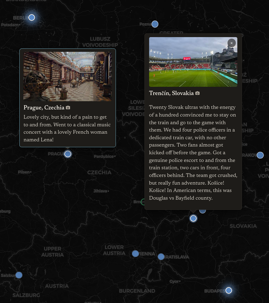
Oh, and just adding all the travel dots took forever. Over 200 new locations in a JSON file. I had been curating the list for a while, even updating it manually while I was traveling, but kept missing some, and getting the naming convention to look consistent took some effort too. I used Claude to pull the metadata from my photos over the last couple of years and fill in whatever I had missed. "Future Adventures" are basically just spots I had highlighted on Google Maps from talking about travel with people at hostels.
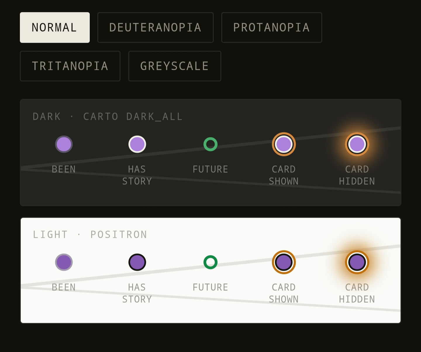
I went back and forth a lot on color for the travel dots, which might eventually drive site theming as a whole. I tried purple instead of blue because I've always liked purple/green combinations, however it felt right to switch back to blue and did so. Blue and green are not quite as good for color blindness accessibility, but the shape and glow animations should be differentiating enough.
Adding links from the travel page to a filtered gallery view is also something I really like. Cities near each other are grouped on purpose, so you can see places like Bellevue and Seattle at the same time. I've decided that this is the only way I want to be able to filter photos, going from the location on the travel page. The default gallery page is sorted by date, and I want to keep the page minimal. Adding a filter at the top ruined it for me. Maybe I'll change my mind again in the future.
Speaking of the photos page, I mostly had that how I wanted it already, but I added year headings, some optimizations to the photo viewer and page loading, and alt text on every photo. The alt text was generated locally with the qwen3-vl:32b-instruct model through Ollama, in one pass of all photos that took about 30 minutes. Some came back with the wrong name or a caption I didn't like and had to be corrected by hand. Going forward, alt text will get added when the photo does, so this was a one-time thing.
The data cleanup was slower. A lot of photos were missing EXIF data, so they had to be reviewed manually for location tagging, and some dates had to be estimated because they were screenshots or messages from other people.
I added a projects page because a certain Belgian friend keeps bugging me to write my book I haven't started yet, but I told her I was busy working on other projects (like this website) and it wasn't going to be a priority for a bit. She wanted to know what my other projects were, so here you are. I'm really glad I added it though, as it's the type of thing that will motivate me to keep the ideas moving forward.
One interesting thing to note: during the travel page overhaul I added accessibility features like different dot shapes for places I have been versus places I have not, filled against open. Without me specifying it while building the projects page, Claude applied the same logic to in motion versus at rest. It makes me question whether my initial assertion that the design choices are my own still holds true, because I hadn't even thought about that for that page.
Home hero edit
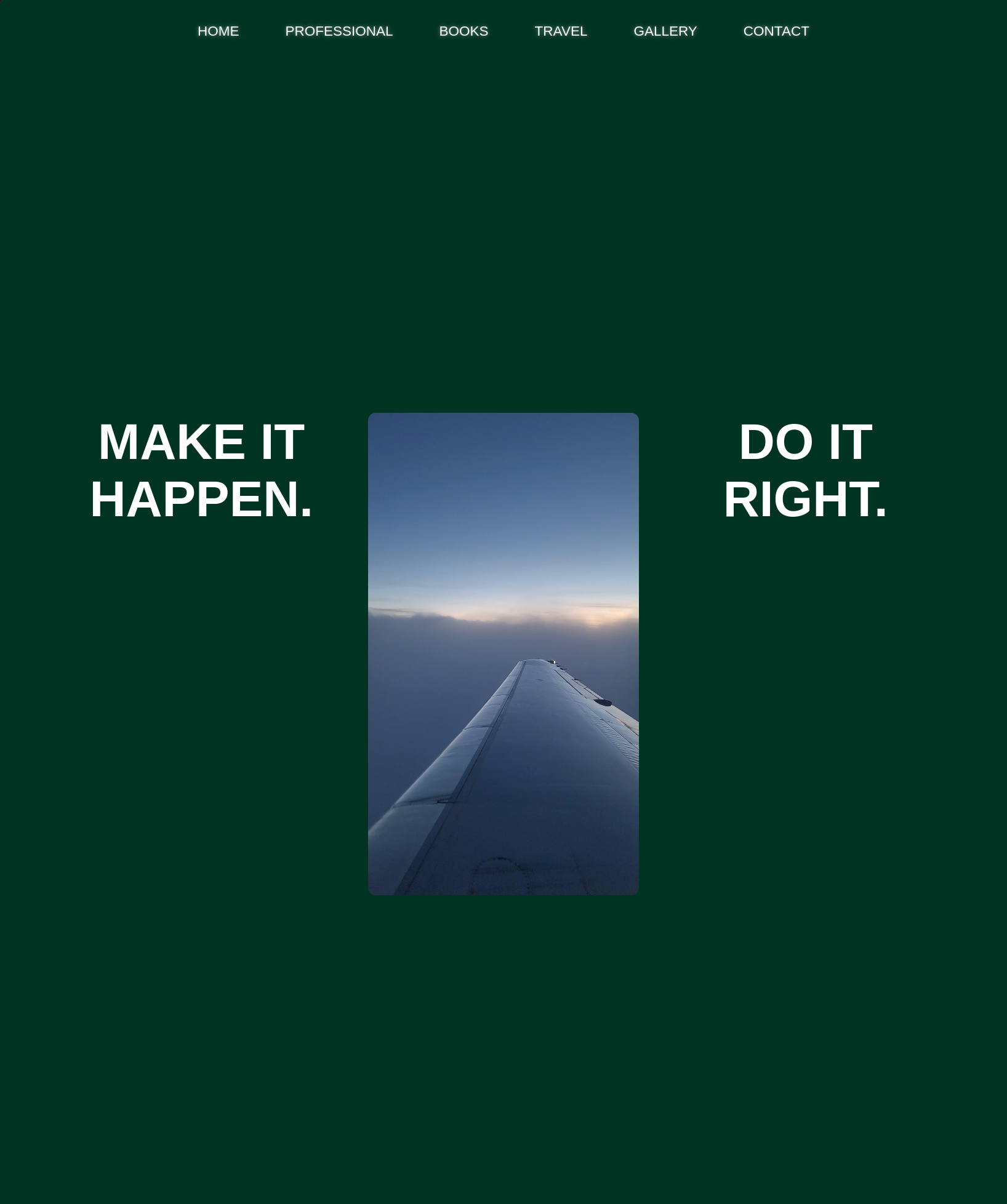
For the longest time I've been putting off getting an actual homepage video edited. I had the same unoptimized, minute-long video of a plane taking off, which half the time didn't load properly. Now I actually have something that makes the site feel complete.
I will probably revise the cut with a few new cuts and perfect the pace and timing as I get new clips, but I'm pretty happy with how it is now. Much better than the plane that didn't load for sure. This is the first time I've edited a video in years, and the times before were when I was much younger, with much more limited software.
For the edit itself, I used DaVinci Resolve 21. Nothing too fancy, just dragging and dropping the clips and trimming. Most clips are set to 48 frames at 24 fps, but I might shorten to around 40 soon to step up the pace and feeling. The ending clip of resetting the world was something I knew I would use for this the second I found it, but unfortuantely at the time I was planning for this to be a vertical cut. I was able to zoom and reframe quite a bit so it still works. The video is 16:9, there is dynamic cropping over the page that adapts based on screen size, so it's closer to 4:3 in most instances.
I had the idea to mix in old videos of me for a while, intending to start with me at my first birthday, but finding the clip of me crying and contrasting that to a calm lake in Bellingham felt a little bit too good.